Tuesday, February 7, 2017

iPhone Screen Size and Web Design Tips

Apple updated its iPhone a bit ago making the form factor much bigger. The iPhone 6 screen size is both wider and taller and the iPhone 6 Plus also has a higher pixel density. This is an update to my previous post about designing websites for the iPhone 5. It’ll cover these new screen sizes and try to clarify how this all works.
Update: Apple has released the iPhone 6s and iPhone 6s Plus. The iPhone 6s screen size is identical to the previous iPhone 6 versions, so feel free to follow the existing sizes below.
Update 2: Apple just announced the iPhone 7 & 7 Plus. These iPhone 7 models follow the same screen sizes as the 6s & 6s Plus, you can use the sizes listed below.

iPhone Screen Measurements

There are a few different values to consider when looking at the iPhone screen sizes. I’m going to get these values defined here so the chart below makes more sense:
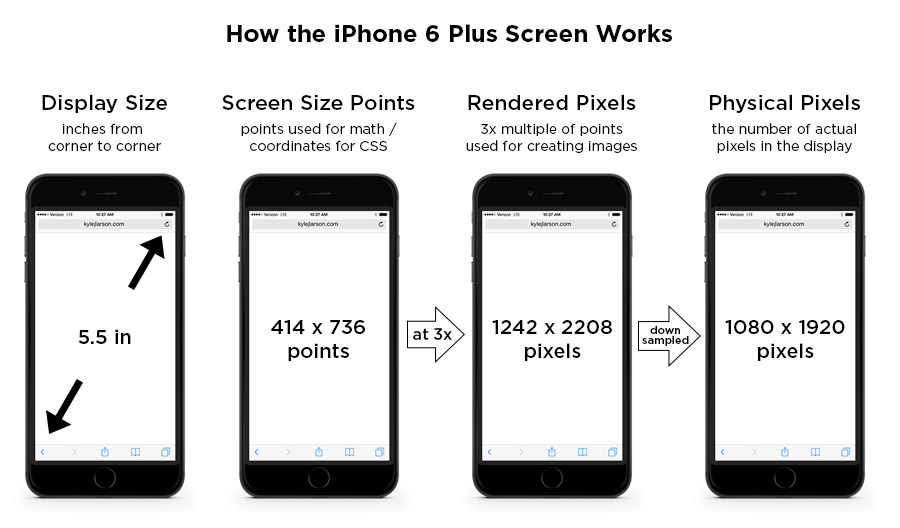
iPhone Display Size (inches) – This is diagonal measure of the screen, from corner to corner, just like you’d measure a TV.
iPhone Screen Size (points) – These points are the size that the device is using for coordinates. If you’re designing for the web (using CSS or JavaScript) these values will be helpful. iPhones use Retina screens which have a higher pixel density. This means they take the larger iPhone resolution (mentioned above) and compress those pixels into a smaller space to make the image look sharper.
iPhone Rendered Pixels – This is the full number of pixels that are being rendered. This is the value you get when you apply the multiplier (1x, 2x, 3x) the device uses to the screen size in points. If you’re creating an image and want it at the max resolution, this is the size you’d use. 
iPhone Physical Pixels – This is the actual screen’s pixel resolution. The iPhone 6 Plus is using a a larger image resolution on a screen with a smaller number of physical pixels, so it needs to be downsampled to this size. This value is really only important in a specifications perspective, but shouldn’t really affect your designs.
iphone 6 plus screen

iPhone Screen Size Comparison

This image shows the browser screen size of the iPhones for use when writing CSS. See the table below for all the measurements of each phone. If you’re using iOS 8 the Safari menu height is consistent across all the iPhones.
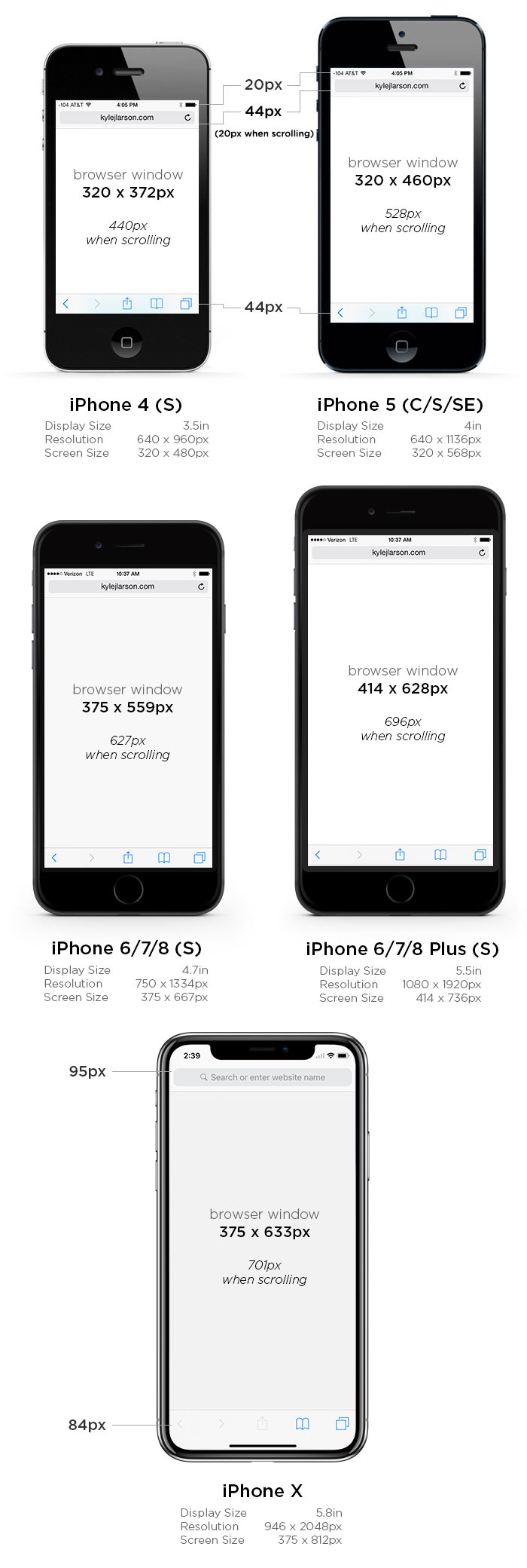
iphone 6 screen size
iPhone 4iPhone 5iPhone 6/7iPhone 6/7 Plus
Display Size3.5 in4 in4.7 in5.5 in
Screen Size320 x 480 points320 x 568 points375 x 667 points414 x 736 points
Rendered Pixels640 x 960 (@2x)640 x 1136 (@2x)750 x 1334 (@2x)1242 x 2208 (@3x)
Physical Pixels640 x 960640 x 1136750 x 13341080 x 1920
Pixels Per Inch (PPI)326326326401
Browser Size Portrait320 x 372 px
(320 x 440* / 320 x 460**)
320 x 460 px
(320 x 528* / 320 x 548**)
375 x 559 px
(375 x 627* / 375 x 647**)
414 x 628 px
(414 x 696* / 414 x 716**)
Browser Size Landscape480 x 212 px
(480 x 280* / 480 x 300**)
568 x 212 px
(568 x 280* / 568 x 300**)
667 x 267 px
(667 x 335* / 667 x 355**)
736 x 306 px
(736 x 374* / 736 x 394**)
* – measurements with the small browser navigation bar
** – measurements without any browser chrome for a web app
Note that the iPhone 6 Plus is a 3x screen. For the previous iPhones you can double the screen size values to figure out the max size of your retina image, but on the iPhone 6 Plus you’ll want to triple that value (i.e. a full screen graphic would be 1242 x 2208).

Using the iPhone 6 Screen Size for Web Design

If you’re coding your site using Responsive design in order to fit the iPhone well, you may have some sizing issues if you don’t tell the device not to zoom in. You can do this by adding this viewport metatag into the head of your site:
<meta name="viewport" content="initial-scale=1.0">

iPhone 6 Startup Screen

If you’re going to be setting up your website so users can save it and run it as a web app you can add a startup image to display when the page is loading.
First add the web app meta tag (also make sure you’re not using a width in your viewport meta tag as this can cause issues):
<meta name="apple-mobile-web-app-capable" content="yes" />
Then create startup images at these sizes for compatibility with each phone:
iPhone 1 – 3gs:320 x 460 px
iPhone 4 – 4s:640 x 920 px
iPhone 5:640 x 1096 px
iPhone 6:750 x 1294 px
iPhone 6 Plus:1242 x 2148 px
Then add the code in your page’s header to link to them:
<link rel="apple-touch-startup-image" href="images/ios_startup.png"> 
<link rel="apple-touch-startup-image" href="images/ios_startup@2x.png" sizes="640x920">
<link rel="apple-touch-startup-image" href="images/ios_startup-large@2x.png" sizes="640x1096">
<link rel="apple-touch-startup-image" href="images/ios_startup-6@2x.png" sizes="750x1294">
<link rel="apple-touch-startup-image" href="images/ios_startup-6-plus@3x.png" sizes="1242x2148">

iPhone 6 Icons

When designing iPhone 6 icons you’ll notice there is a new size for the higher pixel density iPhone 6 plus. If you’d like to add an icon to your site that people will see when they save it to their homescreen, take a look at my article on creating an iPhone icon, which includes the sizes you’ll need.

How to Add Icons for iPhone, iPad & Android to Your Website

Many sites currently add a favicon before launch that is visible in your user’s browser tabs and bookmarks, but lots of sites are still missing icons for iOS. By adding an iOS icon, anyone who decides to save your webpage to the home screen of their iPhone, iPad, or Android* will see a nice app-like icon rather than an image of your page.
The first step is creating an image. To support the newest high resolution iPhone and iPad you’ll want to create several different sized images (The device will take the nearest size larger than it’s default size if you don’t have them all). You can save your images as PNGs to any directory on your site.
With the icons on older iOS versions you had to determine if you were going to use apple-touch-icon-precomposed vs letting apple apply some effects to your icon. That is no longer a concern. You’ll just need to create a square icon and it will round the edges for you.
ios 7 icons
Here is a table of the current iOS icon sizes from Apple:
iPhone 6/7, iPhone 6/7s, iPhone SEiPad / iPad MiniiPad ProiPhone 6/7 Plus, iPhone 6/7s Plus
120×120152×152167×167180×180
For Android icons you’ll want to follow these specifications:
Android RegularAndroid Hi-Res
128×128192×192
Next you’ll just add a simple bit of code to the HEAD of your site so the devices can find your images (iOS will find these automatically if they are in your site’s root directory and named this way, but it’s recommended to include it). Android uses the two icons with rel=”icon” and apple uses the ones prefixed with “apple-“:
<link href="http://www.yoursite.com/apple-touch-icon.png" rel="apple-touch-icon" />
<link href="http://www.yoursite.com/apple-touch-icon-152x152.png" rel="apple-touch-icon" sizes="152x152" />
<link href="http://www.yoursite.com/apple-touch-icon-167x167.png" rel="apple-touch-icon" sizes="167x167" />
<link href="http://www.yoursite.com/apple-touch-icon-180x180.png" rel="apple-touch-icon" sizes="180x180" />
<link href="http://www.yoursite.com/icon-hires.png" rel="icon" sizes="192x192" />
<link href="http://www.yoursite.com/icon-normal.png" rel="icon" sizes="128x128" />
Make the first apple one the 120 x 120.
If you don’t want to create all these images, you should at least create the larger resolution ones. That way they’ll look good on the hi-res devices. The older devices will load the closest size available to their required size and shrink them down (this works but isn’t ideal if you want complete control and the fastest download).
If you’re creating your iOS icon image you can find templates for use around the web; here’s a good one: iOS App Icon. Note that you’ll only need some of the icons represented in these templates unless you’re releasing an app in the App Store.
ios icon homescreen

Creating Retina Images for Your Website

Apple’s newest devices feature the Retina Display, a screen that packs double as many pixels into the same space as older devices. For designers this immediately brings up the question, “What can I do to make my content look outstanding on these new iPads and iPhones?”. First there are a few tough questions to consider, but then this guide will help you get started making your websites and web apps look amazingly sharp with Retina images!
retina image comparison

Things to Consider When Adding Retina Images

The main issue with adding retina images is that the images are double as large and will take up extra bandwidth (this won’t be an issue for actual iOS apps, but this guide is covering web sites & web apps only). If your site is mostly used on-the-go over a 3G network it may not be wise to make all your graphics high-definition, but maybe choose only a select few important images. If you’re creating something that will be used more often on a WI-FI connection or have an application that is deserving of the extra wait for hi-res graphics these steps below will help you target only hi-res capable devices.

Simple Retina Images

The basic concept of a Retina image is that your taking a larger image, with double the amount of pixels that your image will be displayed at (e.g 200 x 200 pixels), and setting the image to fill half of that space (100 x 100 pixels). This can be done manually by setting the height and width in HTML to half the size of your image file.
<img src="my200x200image.jpg" width="100" height="100">
If you’d like to do something more advanced keep reading below for how you can apply this technique using scripting.

Creating Retina Icons for Your Website

When users add your website or web app to their homescreen it will be represented by an icon. These sizes for regular and Retina icons (from Apple) are as follows:
ios icon samples
iPhone57 x 57
Retina iPhone114 x 114
iPad72 x 72
Retina iPad144 x 144
For each of these images you create you can link them in the head of your document like this (if you want the device to add the round corners remove -precomposed):
<link href="touch-icon-iphone.png" rel="apple-touch-icon-precomposed" />
<link href="touch-icon-ipad.png" rel="apple-touch-icon-precomposed" sizes="72x72" />
<link href="touch-icon-iphone4.png" rel="apple-touch-icon-precomposed" sizes="114x114" />
<link href="touch-icon-ipad3.png" rel="apple-touch-icon-precomposed" sizes="144x144" />
If the correct size isn’t specified the device will use the smallest icon that is larger than the recommended size (i.e. if you left out the 114px the iPhone 4 would use the 144px icon).

Retina Background Images

Background images that are specified in your CSS can be swapped out using media queries. You’ll first want to generate two versions of each image. For example ‘bgPattern.png’ at 100px x 100px and ‘bgPattern@2x.png’ at 200px x 200px. It will be useful to have a standard naming convention such as adding @2x for these retina images. To add the new @2x image to your site simply add in the media query below (You can add any additional styles that have background images within the braces of the same media query):
.repeatingPattern {
     background: url(../images/bgPattern.png) repeat;
     background-size: 100px 100px;
}

@media only screen and (-webkit-min-device-pixel-ratio: 2) {
     .repeatingPattern {
          background: url(../images/bgPattern@2x.png) repeat;
     }
}

JavaScript for Retina Image Replacement

For your retina images that aren’t backgrounds the best option seems to be either creating graphics with CSS, using SVG, or replacing your images with JavaScript. Just like the background images, you’ll want to create a normal image and one ‘@2x’ image. Then with JavaScript you can detect if the pixel ratio of the browser is 2x, just like you did with the media query:
if (window.devicePixelRatio == 2) {

//Replace your img src with the new retina image

}
If you’re using jQuery you could quickly replace all your images like this very basic example below. It’s a good idea to add a class to identify the images with hi-res versions so you don’t replace any others by mistake. I’ve added a class=”hires” for this example. Also make sure you have the standard (non-retina) image height and width set in the HTML:
<img class="hires" alt="" src="search.png" width="100" height="100" />
<script type="text/javascript">
$(function () {

 if (window.devicePixelRatio == 2) {

          var images = $("img.hires");

          // loop through the images and make them hi-res
          for(var i = 0; i < images.length; i++) {

            // create new image name
            var imageType = images[i].src.substr(-4);
            var imageName = images[i].src.substr(0, images[i].src.length - 4);
            imageName += "@2x" + imageType;

            //rename image
            images[i].src = imageName;
          }
     }

});
</script>

Server-Side Retina Images

If you’d like to implement a server-side retina image solution, I recommend checking out Jeremy Worboys’ Retina Images (which he also posted in the comments below). His solution uses PHP code to determine which image should be served. The benefit of this solution is that it doesn’t have to replace the small image with the retina one so you’re using less bandwidth, especially if you have lots of images that you’re replacing.

Website Optimization for Retina Displays

If you’re looking for additional information on creating Retina images, I’ve recently had a short book published called Website Optimization for Retina Displays that covers a range of related topics. It contains some of what is above, but also includes samples for many different situations for adding Retina images. It explains the basics of creating Retina images, backgrounds, sprites, and borders. Then it talks about using media queries, creating graphics with CSS, embedding fonts, creating app icons, and more tips for creating Retina websites.